Måned: mars 2015

Week 20: LA – Mastering the Art of Product Photography

Question 1

Draw up a list of the most important aspects of a product photograph. Refer to shadows, lighting, quality, ISO and editing in your answer. Mention at least five things.

  1. Smooth and low-contrast shadows
  2. No harsh lights reflecting in the object
  3. Sharp, noise-free images with low ISO
  4. Balanced composition
  5. High depth-of-field sharpness
  6. Shows the object as it is, no manipulation
  7. Simple!

Question 2

Make your own DIY light tent.

Check!

Take product photographs of the following objects:
Something fluffy, like a stuffed animal
Something shiny, like a knife and fork
Something hard, like a book or a mug
A liquid, like a glass of wine

Draw a diagram of your lighting scenario for each of the above photographs and submit it along with the photographs.

Edit your photographs with the software of your choice. Write an accompanying paragraph for each of your photographs and explain what you did during the editing process.

Something shiny

productphoto original

Something shiny: Original

shiny

Something shiny: Lighting

productphoto

Something shiny: Edit. I brightened it a bit, and adjusted the levels, contrast and colors. I also cleaned up a couple of marks and cropped it.

Something fluffy

productphoto original_1

Something fluffy: Original

fluffy 1

Something fluffy: Lighting 

productphoto_1

Something fluffy: Edit. I adjusted the contrast a bit, and cropped it.

fluffy 2

Something fluffy 2: Lighting 

productphoto_3

Something fluffy 2: Hello! I did a little adjusting of contrast and cropped.

Something hard

productphoto original_4

Something hard: Original

hard 1

Something hard: Lighting

productphoto_4

Something hard: Edit. I changed the whitebalance a little bit, but when I looked at it now I think the original is better :)

Something liquid

productphoto original_5

Something liquid 1: Original.

liquid

Something liquid: Lighting

productphoto_5

Something liquid 1: Edit. The light in the original picture was very uneven, since I was focusing on the reflections in the glass. So I edited the white balance and used a gradient adjustment filter (in camera RAW). I also adjusted the levels and contrast and exposure.

productphoto original_6

Something liquid 2: Original.

productphoto_6

Something liquid 1: Edit. Same editing as previous.


Mandatory Assignment 05 – Photo/Illustration

Here is the result from the mandatory assignment 05. The task was to find a product produced before 1970, photograph it and combine the photo with an illustration inspired by the era that the product was made, and create an advertisment from that.

I found this Remington Lektronic IV shaver in a 2nd hand store. It is made around 1965, so my ad is inspired by the happy 60s! And yes, that is real beard that I gatherd and photographed. And OK, its weird :)

Mandatory Assignment 05 <- pdf

It isn’t really a black line around the ad, it was just to separate it from the background.

Skjermbilde 2015-03-20 kl. 13.44.50

Week 19 – Learning activities

This week I decided to change the strategy on how I’m working, because usually I start the week with reading the lesson and doing the LAs. And when the time comes for working on the MAs, I’m a little tired and looking forward to the weekend, and the quality of the work drops, I think. But i knew that this week had a fun learning activity, so I decided to start off the week working with the MA, and finish off with a fun learning activity.

LA – Analysing the Use of Design Fundamentals

design-drawing_clip_image016What fundamentals are used successfully? Describe in detail what you think is the most successful aspect of the illustration (remember to focus on the fundamentals.)

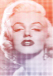
The image is made with dots in different colors, and that forms an image of Marilyn Monroe. I think the dot usage works very well, and gives a Hollywood-feeling. A design principle that is used is repetition, because the dots are repeating through the image. This, and the color usage,  gives a feeling of unity that I like a lot.

What style from the past is being used in a new way in this illustration? If no previous style is clearly apparent, does it use some form of pastiche? Why do you think this specific style or pastiche was used? Describe in detail whether you think it was used successfully or not.

I think this image reminds me of Pop art, like in the comics, both the dots and the model. The differnce is that the dots are more important here, they are given a new role. I think he used this style because he maybe wanted to make a new portrait of MM in his own way. I think this execution works very well, it reminds me of Hollywood light signs and the pop art sytle, but it is still a piece of its own.

Read again what Mondrian said about the expression of beauty or self. Which do you think played the dominant role in the execution of this illustration? Explain your thoughts.

“Although art is fundamentally everywhere and always the same, nevertheless two main human inclinations, diametrically opposed to each other, appear in its many and varied expressions. One aims at the direct creation of universal beauty, the other at the aesthetic expression of oneself, in other words, of that which one thinks and experiences.”

Honestly, I dont know. I think it is not so much personality from the designer in this piece, I can’t tell from the illustration how he was feeling or how he was. I think it’s a piece that everyone can enjoy, because MM is beautiful and it is a nice execution.

If you had to create this illustration, before starting the actual execution, what would your initial thoughts be on…

Colour (what would your approach to colour be?)

I would use warm and feminine colors that had similarities with light posters. (with that I mean like this:)

Line (what would you like to portray with the use of line?)

The lines are made up of dots, but i would try to make them look like dots and still be percieved as lines. Repetition creates rythm, and I think this would help create the «Hollywood-life» feeling.

Composition (what would you wish to instil in the viewer by the use of composition alone?)

It is a good composed portrait following the golden ratio. Her face fills the frame, and make her seem close, but the lack of detail make her seem far away at the same time.

LA – Applying philosophy to design

Design a book cover for a thriller book called “The Fall of Imagination” by Sam Wan. This book does not exist and is open to your interpretation as to the subject matter.

  • It must be designed by clearly drawing inspiration from a previous design style.
  • The size of the cover must be A5 and it should include a front, spine and back.
  • The cover must contain a vector illustration that forms the basis of the design.
  • The cover must contain the title and the name of the author.

I designed this cover inspired by the style plakatstil, which is simple and focuses on the product image and a simple word. I feel I had too little time to do this cover since I have been busy with the MA05 and is going away this weekend. It is really done just quick, but you get the idea and I hope I get the time to work more on it for the portfolio :)

Fail of imagination <- pdfUke-19-Fail-of-imagination


Week 18 – Applying philosophy to design

Design an A4 poster for a humanitarian cause you feel passionate about. For example, creating awareness and a call for action against human trafficking. You must apply pastiche to your design. Use a style of propaganda used during the Modernism era and create your own, unique design in a contemporary context.

  • Start by creating at least 5 thumbnails for your design. These thumbnails should be handed in with your assignment.
  • Write a rationale or explanation for your poster of at least 350 words. Why it is necessary to create awareness of the humanitarian cause?
  • Give an explanation for your creative execution, mention the use of colour and graphics as well as typography.
  • Give examples of the designs you used as inspiration and why it is applicable to your design.
  • Hand in your designs as PDF documents. You may use any medium for this. Hand in PDFs of your rationale and thumbnails as well.

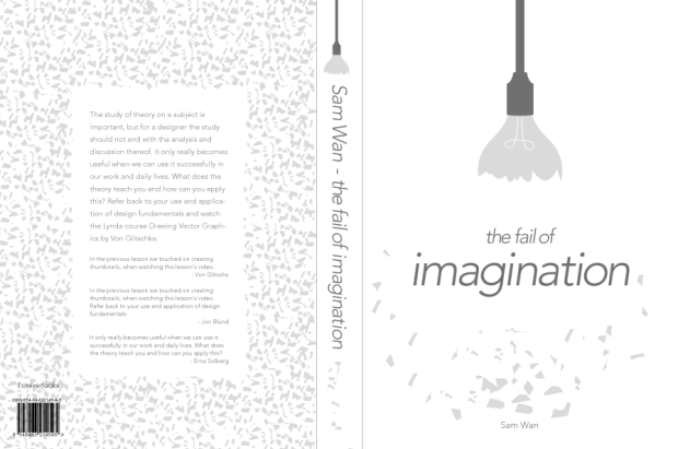
I choose to make a poster to create awareness of a cause that I care about, the abortion of children because of Downs syndrome etc. The poster is a pastiche of this poster by Dimitri Moor.

You can se the result and my rationale by clicking on the link under.

Poster and rationale (pdf)


Week 18: LA – Focusing on Design With a Conscience 

Analyse Frank Shepard Fairey poster for the 2008 U.S. Presidential Election and give your opinion on the use of style and its efficacy (effekt). Also critique the use of pastiche and typography. Write one page (about 350 words) on your opinion of this design and substantiate your answers with examples. 

Frank Shepard Fairey designed the Obama Hope poster in 2008 in conjunction with the precidental election. Shepard Fairey is a street artist, and this shows in this poster.

It is simple and has impact. You can see that it is inspired by earlier political posters in the use of stylized imagery or illustration where the person is still very recognizable, and color and typography. Red and blue are political colors and red is a active action color while blue symbolizes trust and loyalty. Tho poster would not have the same impact if it was green and orange. Blue takes up the most place in this poster, but the red is most intense. The color combination red, white and blue is also in the USA flag, and according to Steven Heller, the poster was inspirated by social realism. The usage of a countrys flag colors gives people a stronger relationship to the poster, I think.

Obama is clancing a little up and to the right, as he is looking to the horizon of possibilities, and the look is neither happy or angry, but dedicated and firm. The word HOPE is set in bold uppercase letters, and is a strong part of the message. Its not timid, unsure or faint, but strong and firm.A more decorative font would have caused the message to be weaker. For example, it the font was  Times New Roman, it would have been too «formal». The logo for the Obama champaign, the «Obama sunrise» is featured, wich tie the poster even more to the election, and the font on «hope» is similar to the O in this logo.

The poster reminds me of the Che Guevara poster by Jim Fitzpatrick from 1968, and i think Shepard Fairey’s poster is inspired by this. The person has the same kind of firm glance slightly upward, and they are seen from a lower perspective wich gives them more power and authority. The color usage is similar with a limited color palette, but the typography had a greater role in the Obama poster than the Guevara poster.